Archive resale
Admin App
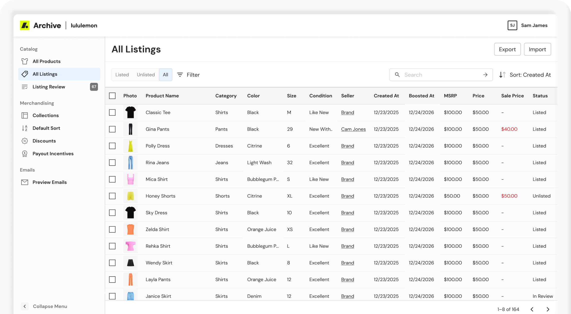
An operational platform for managing resale inventory and merchandising – built to support a model traditional e-commerce tools weren't designed for.
Project Overview
About archive resale
Archive builds and operates resale-as-a-service programs for enterprise brands. These programs include buy-back, listing, resale storefronts, and the operational tools that support them.
the problem
Traditional e-commerce platforms work with stable inventory. In resale, there are thousands of unique listings, each with its own seller, condition, price, and fulfillment. Standard merchandising tools could not meet these needs. As Archive grew, internal tools were added one by one to solve problems, rather than as part of a single system.
the solution
Instead of handling separate feature requests, I approached Admin as a platform that could evolve. We released features in phases to solve immediate business problems and build on each other: Collections, Listings, Listing Review, and Discounts & Seller Incentives. At the same time, I led a full visual redesign of Admin during Archive's rebrand.
MY ROLE
I was the only designer on Admin. I worked closely with an engineer and product manager to set the product direction, turn unclear business needs into clear product choices, and design the full experience.
The Difference in Data Models
Traditional e-commerce
Taylor Dress
Colors
Blue, Green
Sizes
S, M, L
Inventory
Static (100 units)
Price
$148
Resale e-commerce
Taylor Dress
Colors
Blue, Green
Sizes
S, M, L
Inventory
Dynamic (3 units)
Listing · Brand-owned
Size M · Green · Like New · Brand Seller
$60
Listing · P2P
Size S · Blue · Excellent · Seller Name
$50
Listing · P2P
Size L · Green · Good · Seller Name
$40
Defining the platform
Before starting on interface design, I partnered with Product, Growth, and Engineering to map out how the platform would grow. Together, we discussed trade-offs, set priorities, and translated the new resale business into product decisions that could scale for the next phase.
Considerations & Goals
Design constraints
- Data quality varied a lot brand to brand – some brands had detailed attribute data, such as season and color, while others did not
- Requirements continued to evolve in parallel with the underlying business model
- Patterns needed to scale for future modules such as Products, Collections, and Discounts
Business Goals
- Implement merchandising tools to aid in increasing conversion and appeasing brands
- Decrease operational dependence on engineering for routine listing and merchandising
- Replace manual, spreadsheet-driven merchandising processes with scalable solutions
User needs
- Manage and merchandise resale inventory on a brand-by-brand basis
- Find and edit listings without relying on engineering or workaround tools.
- Have clear explanations for resale-specific structures or actions
Strategic Decisions
Build instead of buy
We evaluated existing merchandising platforms and found that they couldn't model resale listings without heavy customization, so we invested in a purpose-built platform.
Ship iteratively
We prioritized the workflows that consumed the most time. We released the smallest, most valuable product to improve that workflow first, then expanded it based on how people used it.
Define the functionality
Many design decisions focused on user behavior and mental models instead of just the interface. Setting shared rules early reduced ambiguity during implementation.
Questions such as whether "All Products" should include historical inventory or how search should behave within collection rules required consistent answers before engineering could begin.
Mapping the System
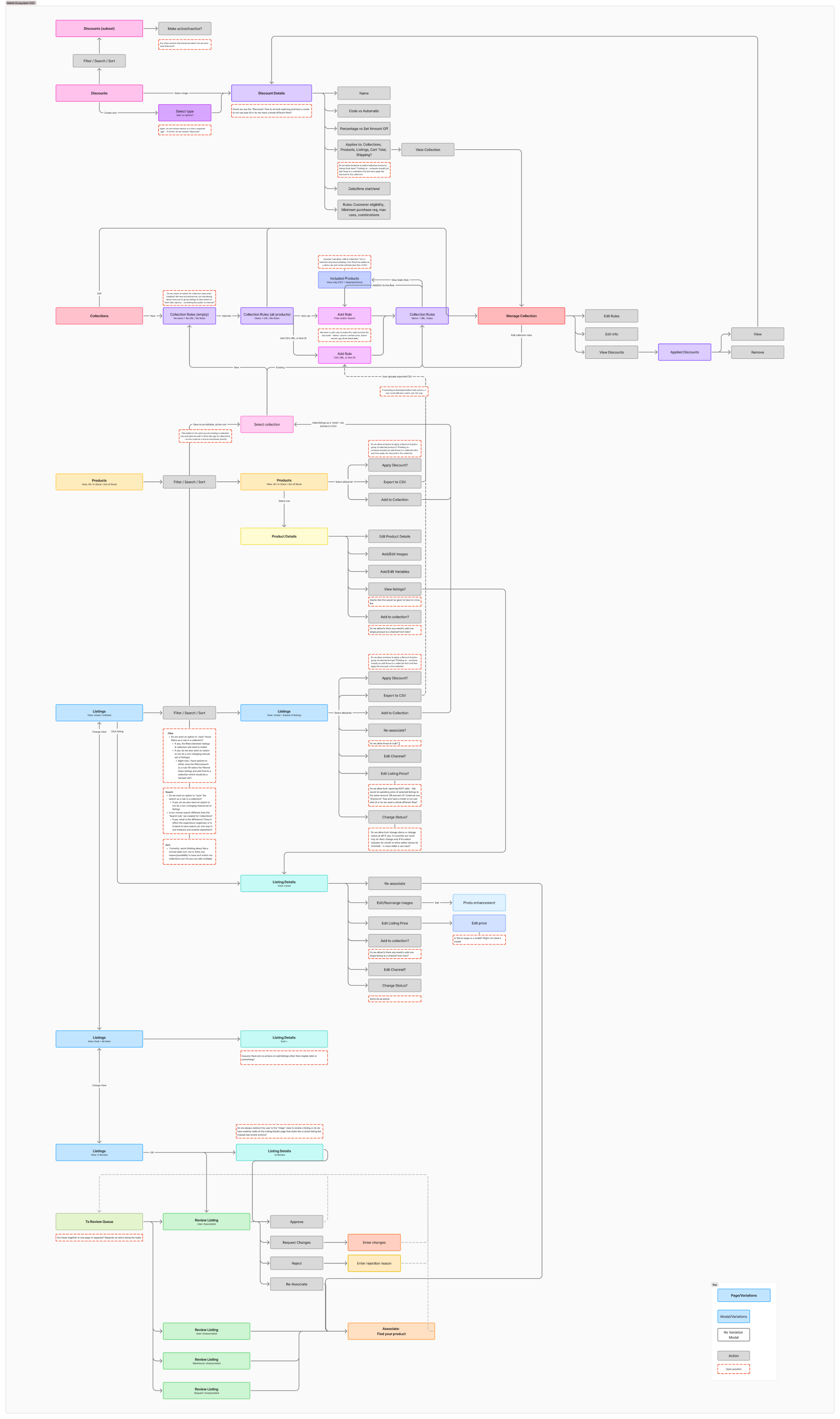
Before designing individual screens, I mapped how Products, Listings, Collections, Reviews, and Discounts connected across the platform. This process identified reusable workflows, surfaced brand-specific requirements, and informed scalable patterns for subsequent solutions.
Examples of brand complexity:
- Manual merchandising controls for brands needing specific product presentation
- Rule-based ranking for seasonal drops and dynamic collections
- Flexible filtering approaches for brands with incomplete product metadata
Soltutions
The platform evolved through four deliberate phases, with each release solving an immediate functional need and creatineg the foundation for the next phase.
phase 1
Collections
Collections became the merchandising foundation for the Admin platform, replacing manual workflows and establishing reusable business logic to support future features.
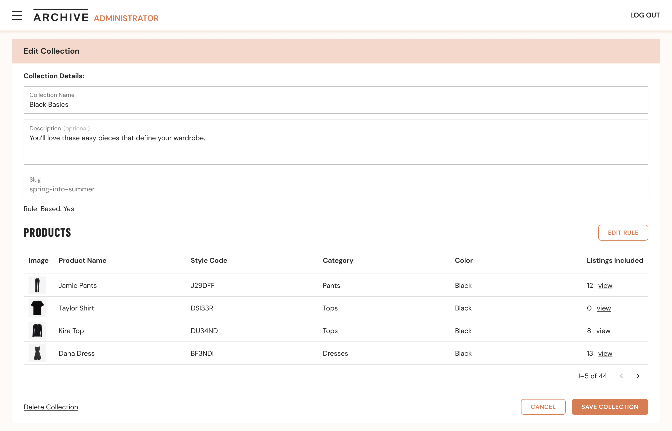
Before
- Merchandising relied on spreadsheets and manual organization of inventory
- Constantly changing inventory made collections difficult to maintain as listings were added, sold, or updated
- Existing 3rd party tools couldn't support the complexity of multiple listing sources, fulfillment models, and brand-specific merchandising strategies
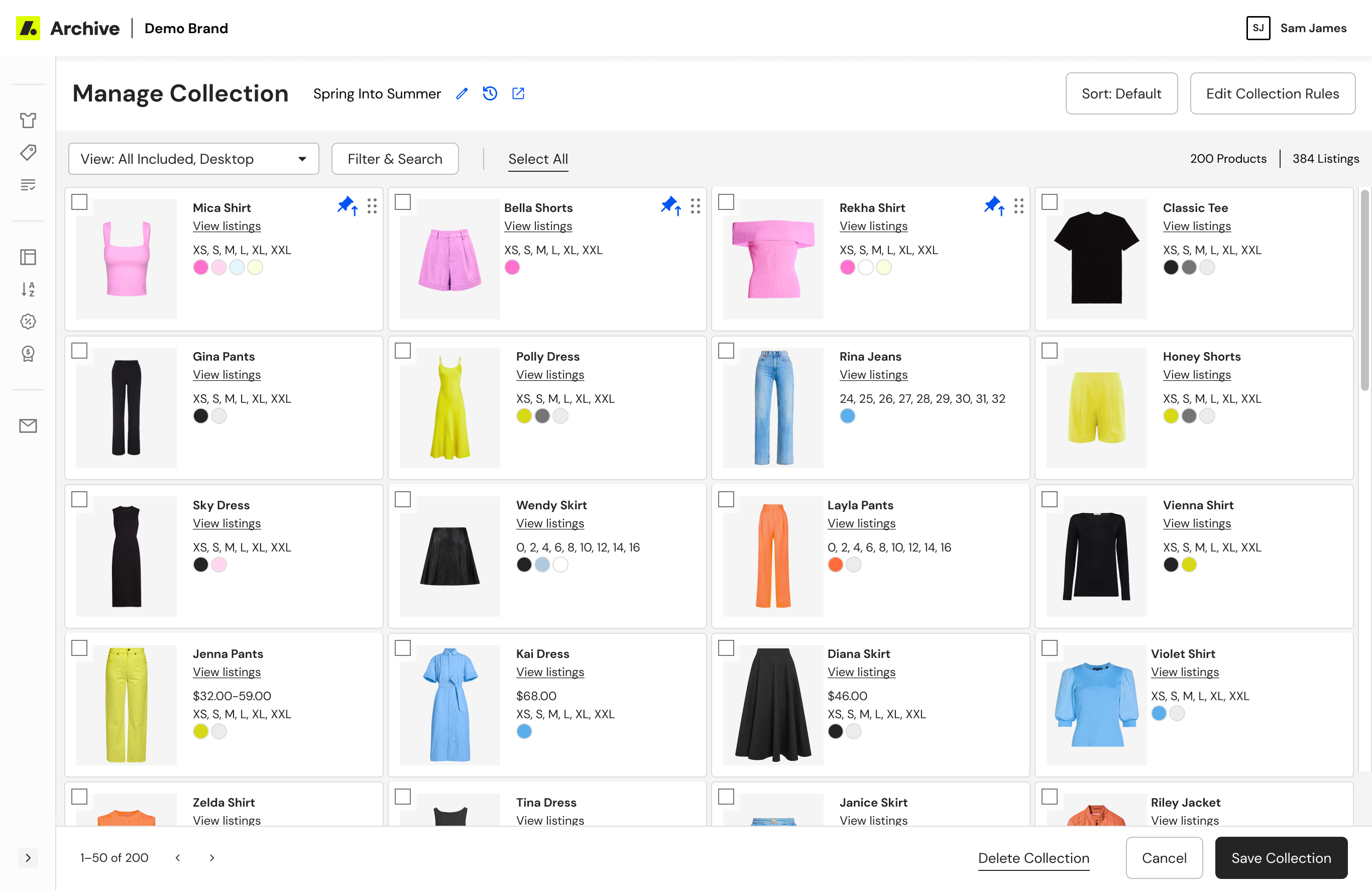
After
- Enabled dynamic collections powered by configurable rules
- Introduced reusable sorting and prioritization logic
- Supported inventory across multiple listing sources and fulfillment models
- Allowed teams to preview matching inventory before publishing
- Reduced manual merchandising through automation
User Testing Collections
Before launching rule-based collections, we conducted moderated testing sessions with brand users, guiding them through the collection-building flow and identifying gaps between the tool’s functionality and user expectations.
Observation
Design Change
Users assumed all products shown were in stock and didn’t understand the difference from traditional e-commerce
Made “In Stock” the default view and added contextual guidance when switching views
Users expected to have to manually drag each item into order
Surfaced rule-based sorting more clearly within the interface
The trashcan icon for removing an item from a collection was interpreted as permanent deletion from the entire catalog
Replaced the icon with explicit show/hide buttons
phase 2
Listings
The original Admin experience was built around Products, but resale operates around Listings. Each listing represents a unique item with its own seller, condition, size, pricing, and fulfillment details. Without visibility into listings, Brand Success teams lacked the tools to manage the inventory actually available to customers.
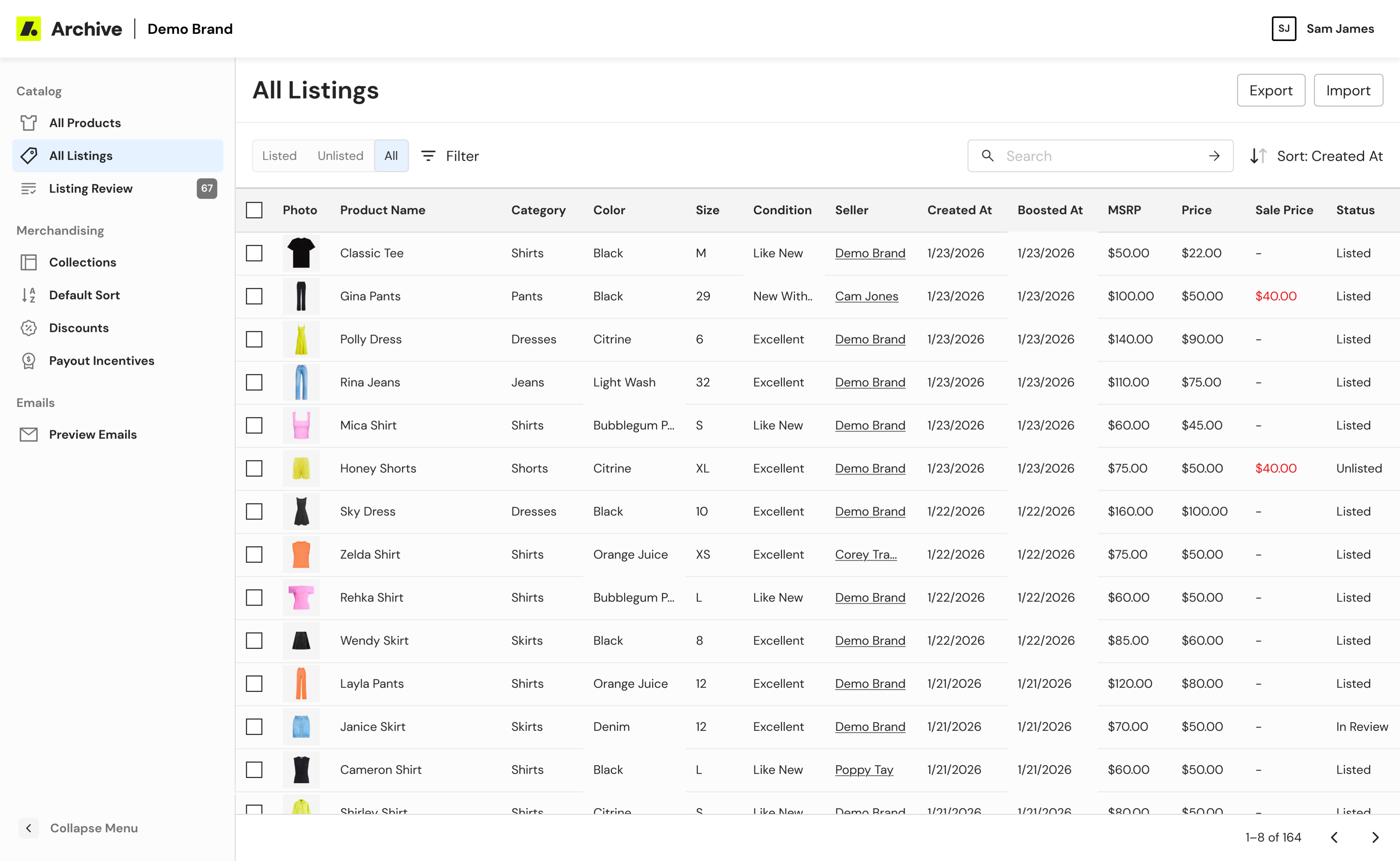
Listings table
A centralized workspace for searching, filtering, and managing live inventory.
- Introduced listing-level visibility alongside product information
- Supported advanced filtering across inventory attributes and operational status
- Surfaced fulfillment and seller information needed for day-to-day operations
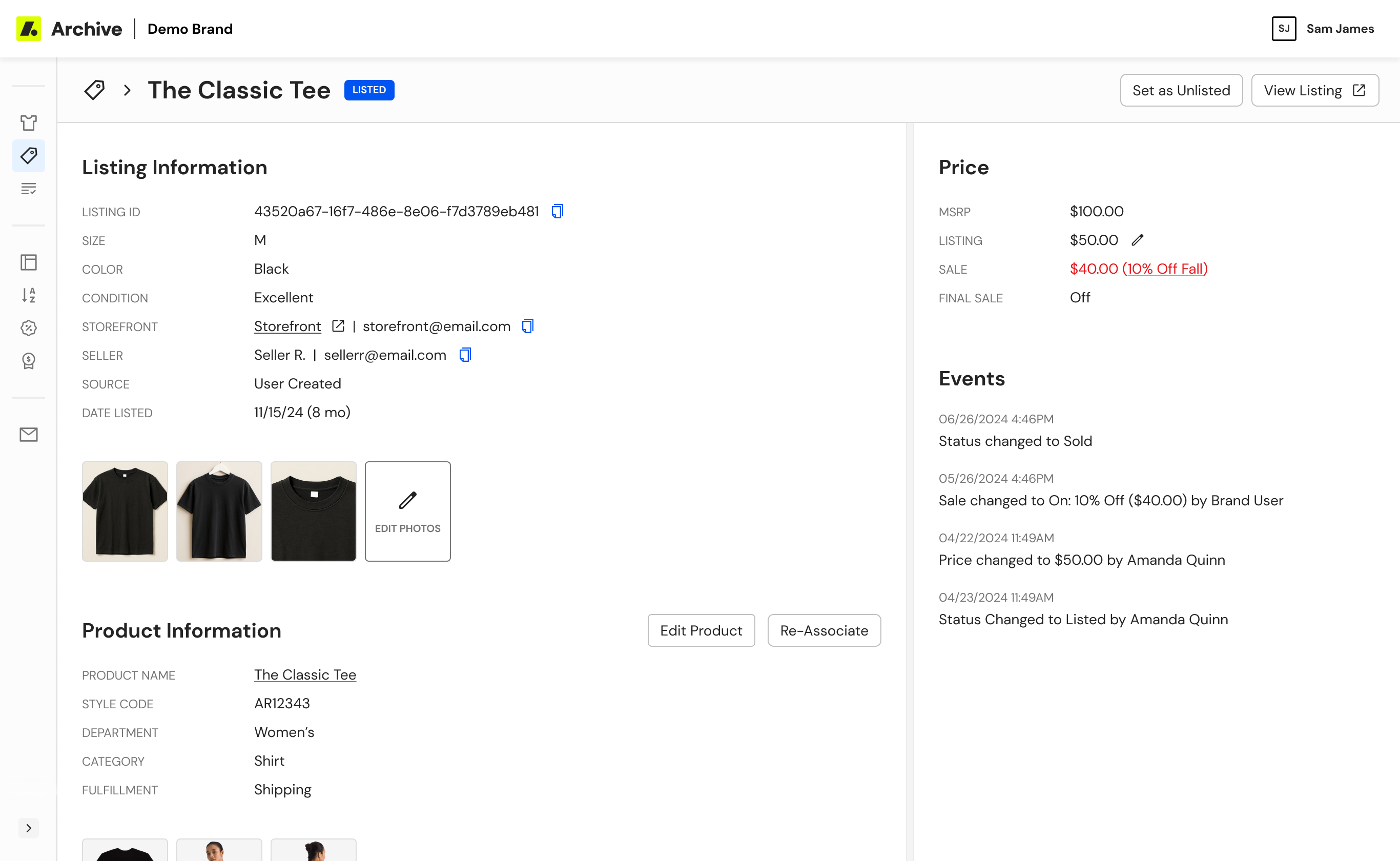
Listing details
A unified view for understanding and taking action on an individual listing.
- Consolidated operational actions and listing metadata into a single workflow
- Prioritized the information support teams referenced most frequently
- Established interaction patterns later reused throughout Admin
- Consolidated operational actions and listing metadata into a single workflow
- Prioritized the information support teams referenced most frequently
- Established interaction patterns later reused throughout Admin
phase 3
Listing Review
Recognizing the success of the new Listing Details pattern, I identified an opportunity to reuse it within Listing Review. Leveraging this existing design pattern improved review efficiency, reduced implementation effort, and reinforced consistency.
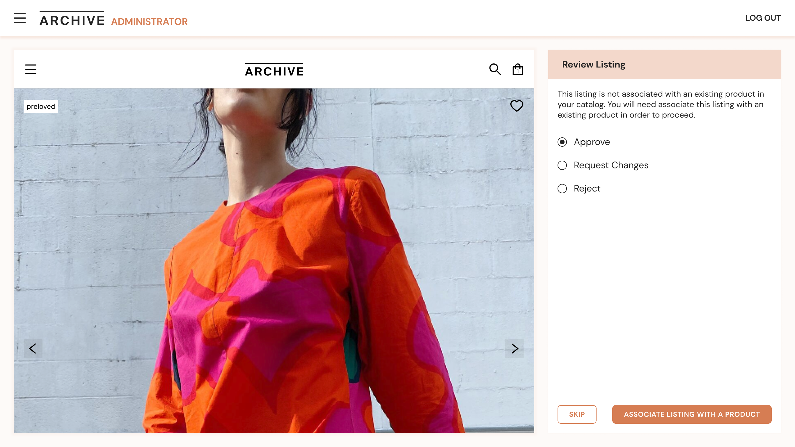
Before
- Reviewing submitted listings required navigating between multiple disconnected screens
- Listing information and review actions were split across separate views, slowing moderation
- Existing workflows duplicated patterns that had already been solved in Listing Details
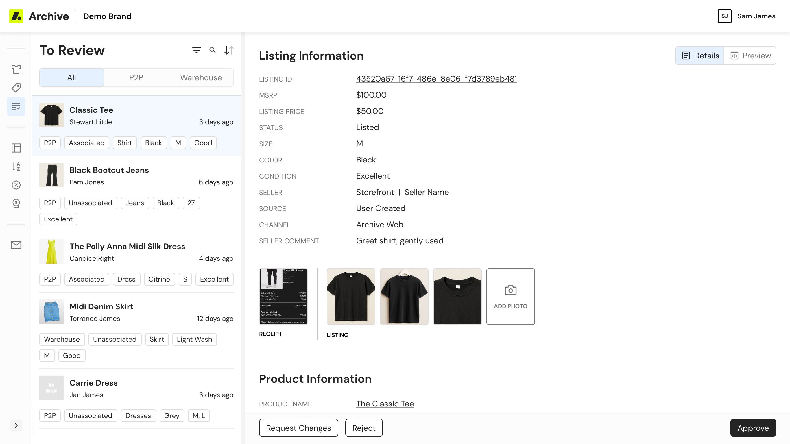
After
- Extended the successful Listing Details pattern into Listing Review
- Consolidated review tasks into a single workflow
- Designed a flexible queue for navigating between listings
- Prioritized listing information over product information
- Reused existing interaction patterns and agentic workflows to accelerate implementation
phase 4
Discounts & Seller Incentives
As partners expanded their resale programs, they needed more flexible ways to promote inventory and encourage participation. Rather than introducing disconnected tools, I extended existing platform patterns to support both merchandising and seller growth.
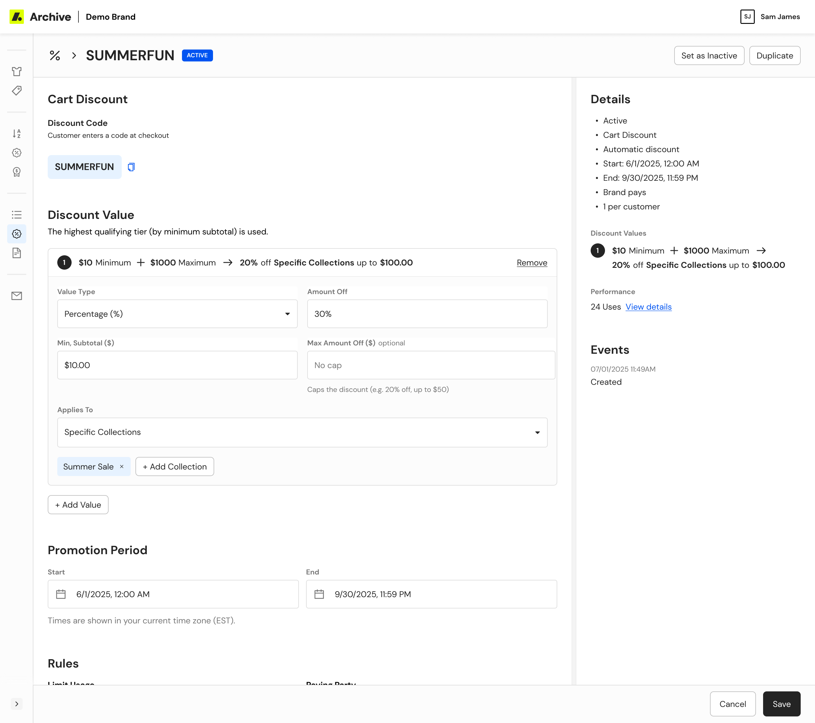
Discounts
Flexible promotional tools for inventory management.
- Designed configurable discount rules for targeted inventory
- Supported multiple promotional strategies without manual updates
- Reused existing collection and rules patterns for consistency
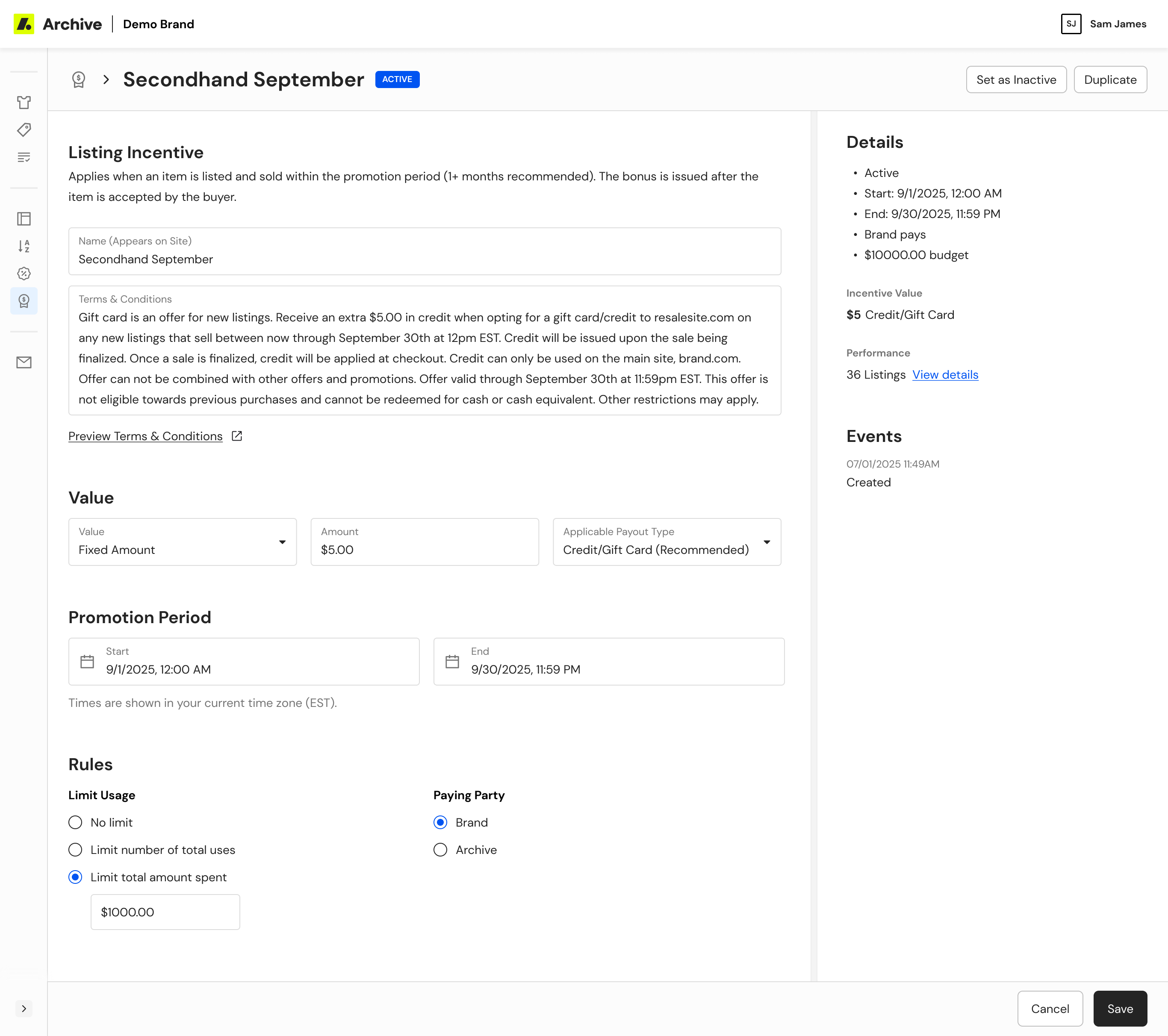
Seller incentives
Operational tools for encouraging seller participation.
- Enabled configurable incentive campaigns
- Supported partner-specific program requirements
- Reused the same interface to reduce learning and implementation effort
ongoing
Visual System & Rebrand
Transformed a collection of independently evolving tools into a cohesive internal platform. This not only created a more polished experience but also improved consistency, accelerated future development, and established a foundation for the product’s continued growth.
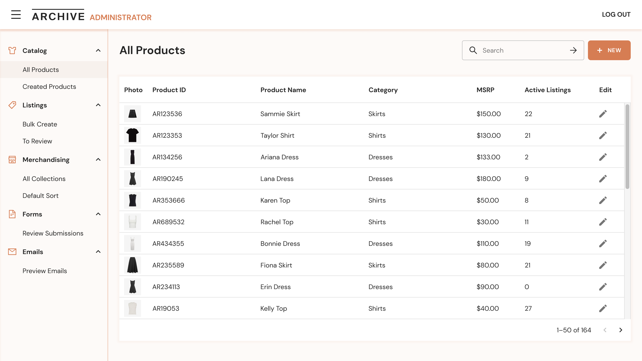
Before
- Admin reflected an earlier stage of the product and brand, with a dense orange-accented interface, oversized typography, and bright CTAs
- There was no shared design system across Admin, Customer Service, and Warehouse Management
- As each product evolved independently, inconsistencies accumulated, making the platform harder to maintain and scale
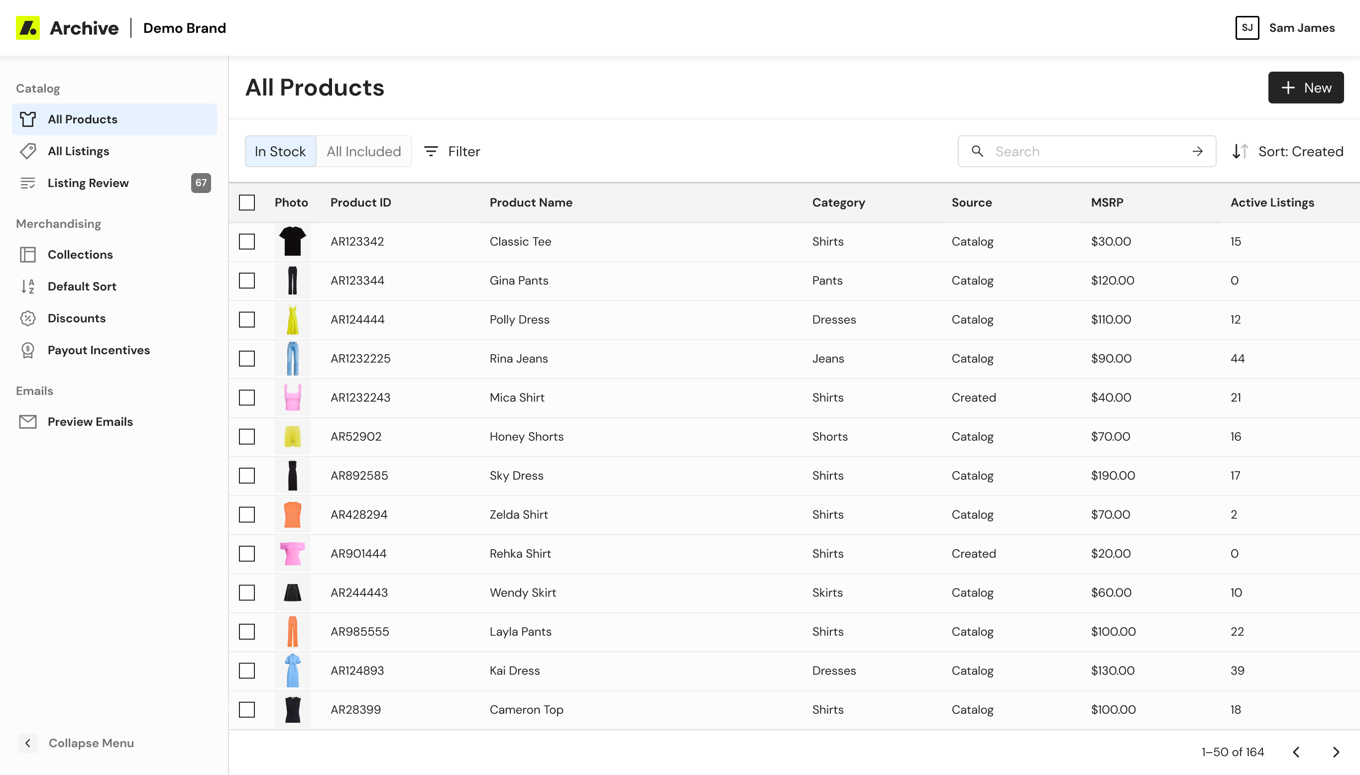
After
- Established a cohesive visual system that unified internal tools under Archive's new brand
- Created a shared design system with reusable components and interaction patterns
- Built a scalable foundation that improved consistency and accelerated future and agentic development
Key Design Decisions
Unified the visual system
Introduced a quieter color palette, modern typography, consistent iconography, and reusable components across Admin, Customer Service, and Warehouse Management.
Prioritized readability
Based on user interviews, I deviated from the common admin-tool convention of small text and dense layouts. We maintained larger text to reduce fatigue for teams spending hours in these workflows.
Created a scalable foundation
Established shared components, patterns, and documentation that reduced duplicated design and engineering effort. Later, partnered with Engineering to optimize agentic workflows, making them easier to extend and maintain.
Impact
Metrics have been generalized to protect confidential business performance data.

Operational Self-Service
Internal and external users could search, view, and safely edit listings without an engineering workaround for the first time
Merchandising Efficiency
A manual, spreadsheet-driven process repeated every few weeks per brand became a rule-based system that keeps itself current
Third-Party Dependence
Building in-house avoided a costly, poorly-fitted vendor tool and let sort logic reflect resale-specific signals instead

Reusable Design Patterns
Table, bulk-action, and detail-page patterns established here became the default starting point for later Admin features and other internal tools
jump to
Archive resale
Admin App
An operational platform for managing resale inventory and merchandising – built to support a model traditional e-commerce tools weren't designed for.
Project Overview
About archive resale
Archive builds and operates resale-as-a-service programs for enterprise brands. These programs include buy-back, listing, resale storefronts, and the operational tools that support them.
the problem
Traditional e-commerce platforms work with stable inventory. In resale, there are thousands of unique listings, each with its own seller, condition, price, and fulfillment. Standard merchandising tools could not meet these needs. As Archive grew, internal tools were added one by one to solve problems, rather than as part of a single system.
the solution
Instead of handling separate feature requests, I approached Admin as a platform that could evolve. We released features in phases to solve immediate business problems and build on each other: Collections, Listings, Listing Review, and Discounts & Seller Incentives. At the same time, I led a full visual redesign of Admin during Archive's rebrand.
MY ROLE
I was the only designer on Admin. I worked closely with an engineer and product manager to set the product direction, turn unclear business needs into clear product choices, and design the full experience.
The Difference in Data Models
Traditional e-commerce
Taylor Dress
Colors
Blue, Green
Sizes
S, M, L
Inventory
Static (100 units)
Price
$148
Resale e-commerce
Taylor Dress
Colors
Blue, Green
Sizes
S, M, L
Inventory
Dynamic (3 units)
Listing · Brand-owned
Size M · Green · Like New · Brand Seller
$60
Listing · P2P
Size S · Blue · Excellent · Seller Name
$50
Listing · P2P
Size L · Green · Good · Seller Name
$40
Defining the platform
Before starting on interface design, I partnered with Product, Growth, and Engineering to map out how the platform would grow. Together, we discussed trade-offs, set priorities, and translated the new resale business into product decisions that could scale for the next phase.
Considerations & Goals
Design constraints
- Data quality varied a lot brand to brand – some brands had detailed attribute data, such as season and color, while others did not
- Requirements continued to evolve in parallel with the underlying business model
- Patterns needed to scale for future modules such as Products, Collections, and Discounts
Business Goals
- Implement merchandising tools to aid in increasing conversion and appeasing brands
- Decrease operational dependence on engineering for routine listing and merchandising
- Replace manual, spreadsheet-driven merchandising processes with scalable solutions
User needs
- Manage and merchandise resale inventory on a brand-by-brand basis
- Find and edit listings without relying on engineering or workaround tools.
- Have clear explanations for resale-specific structures or actions
Strategic Decisions
Build instead of buy
We evaluated existing merchandising platforms and found that they couldn't model resale listings without heavy customization, so we invested in a purpose-built platform.
Ship iteratively
We prioritized the workflows that consumed the most time. We released the smallest, most valuable product to improve that workflow first, then expanded it based on how people used it.
Define the functionality
Many design decisions focused on user behavior and mental models instead of just the interface. Setting shared rules early reduced ambiguity during implementation.
Mapping the System
Before designing individual screens, I mapped how Products, Listings, Collections, Reviews, and Discounts connected across the platform. This process identified reusable workflows, surfaced brand-specific requirements, and informed scalable patterns for subsequent solutions.
Examples of brand complexity:
- Manual merchandising controls for brands needing specific product presentation
- Rule-based ranking for seasonal drops and dynamic collections
- Flexible filtering approaches for brands with incomplete product metadata
Soltutions
The platform evolved through four deliberate phases, with each release solving an immediate functional need and creatineg the foundation for the next phase.
phase 1
Collections
Collections became the merchandising foundation for the Admin platform, replacing manual workflows and establishing reusable business logic to support future features.
Before
- Merchandising relied on spreadsheets and manual organization of inventory
- Constantly changing inventory made collections difficult to maintain as listings were added, sold, or updated
- Existing 3rd party tools couldn't support the complexity of multiple listing sources, fulfillment models, and brand-specific merchandising strategies
After
- Enabled dynamic collections powered by configurable rules
- Introduced reusable sorting and prioritization logic
- Supported inventory across multiple listing sources and fulfillment models
- Allowed teams to preview matching inventory before publishing
- Reduced manual merchandising through automation
User Testing Collections
Before launching rule-based collections, we conducted moderated testing sessions with brand users, guiding them through the collection-building flow and identifying gaps between the tool’s functionality and user expectations.
Observation
Design Change
Users assumed all products shown were in stock and didn’t understand the difference from traditional e-commerce
Made “In Stock” the default view and added contextual guidance when switching views
Users expected to have to manually drag each item into order
Surfaced rule-based sorting more clearly within the interface
The trashcan icon for removing an item from a collection was interpreted as permanent deletion from the entire catalog
Replaced the icon with explicit show/hide buttons
phase 2
Listings
The original Admin experience was built around Products, but resale operates around Listings. Each listing represents a unique item with its own seller, condition, size, pricing, and fulfillment details. Without visibility into listings, Brand Success teams lacked the tools to manage the inventory actually available to customers.
Listings table
A centralized workspace for searching, filtering, and managing live inventory.
- Introduced listing-level visibility alongside product information
- Supported advanced filtering across inventory attributes and operational status
- Surfaced fulfillment and seller information needed for day-to-day operations
Listing details
A unified view for understanding and taking action on an individual listing.
- Consolidated operational actions and listing metadata into a single workflow
- Prioritized the information support teams referenced most frequently
- Established interaction patterns later reused throughout Admin
phase 3
Listing Review
Recognizing the success of the new Listing Details pattern, I identified an opportunity to reuse it within Listing Review. Leveraging this existing design pattern improved review efficiency, reduced implementation effort, and reinforced consistency.
Before
- Reviewing submitted listings required navigating between multiple disconnected screens
- Listing information and review actions were split across separate views, slowing moderation
- Existing workflows duplicated patterns that had already been solved in Listing Details
After
- Extended the successful Listing Details pattern into Listing Review
- Consolidated review tasks into a single workflow
- Designed a flexible queue for navigating between listings
- Prioritized listing information over product information
- Reused existing interaction patterns and agentic workflows to accelerate implementation
phase 4
Discounts & Seller Incentives
As partners expanded their resale programs, they needed more flexible ways to promote inventory and encourage participation. Rather than introducing disconnected tools, I extended existing platform patterns to support both merchandising and seller growth.
Discounts
Flexible promotional tools for inventory management.
- Designed configurable discount rules for targeted inventory
- Supported multiple promotional strategies without manual updates
- Reused existing collection and rules patterns for consistency
Seller incentives
Operational tools for encouraging seller participation.
- Enabled configurable incentive campaigns
- Supported partner-specific program requirements
- Reused the same interface to reduce learning and implementation effort
ongoing
Visual System & Rebrand
Transformed a collection of independently evolving tools into a cohesive internal platform. This not only created a more polished experience but also improved consistency, accelerated future development, and established a foundation for the product’s continued growth.
Before
- Admin reflected an earlier stage of the product and brand, with a dense orange-accented interface, oversized typography, and bright CTAs
- There was no shared design system across Admin, Customer Service, and Warehouse Management
- As each product evolved independently, inconsistencies accumulated, making the platform harder to maintain and scale
After
- Established a cohesive visual system that unified internal tools under Archive's new brand
- Created a shared design system with reusable components and interaction patterns
- Built a scalable foundation that improved consistency and accelerated future and agentic development
Key Design Decisions
Unified the visual system
Introduced a quieter color palette, modern typography, consistent iconography, and reusable components across Admin, Customer Service, and Warehouse Management.
Prioritized readability
Based on user interviews, I deviated from the common admin-tool convention of small text and dense layouts. We maintained larger text to reduce fatigue for teams spending hours in these workflows.
Created a scalable foundation
Established shared components, patterns, and documentation that reduced duplicated design and engineering effort. Later, partnered with Engineering to optimize agentic workflows, making them easier to extend and maintain.
Impact
Metrics have been generalized to protect confidential business performance data.
Operational Self-Service
Internal and external users could search, view, and safely edit listings without an engineering workaround for the first time
Third-Party Dependence
Building in-house avoided a costly, poorly-fitted vendor tool and let sort logic reflect resale-specific signals instead
Merchandising Efficiency
A manual, spreadsheet-driven process repeated every few weeks per brand became a rule-based system that keeps itself current
Reusable Design Patterns
Table, bulk-action, and detail-page patterns established here became the default starting point for later Admin features and other internal tools
jump to
Archive resale
Admin App
An operational platform for managing resale inventory and merchandising – built to support a model traditional e-commerce tools weren't designed for.
Project Overview
About archive resale
Archive builds and operates resale-as-a-service programs for enterprise brands. These programs include buy-back, listing, resale storefronts, and the operational tools that support them.
the problem
Traditional e-commerce platforms work with stable inventory. In resale, there are thousands of unique listings, each with its own seller, condition, price, and fulfillment. Standard merchandising tools could not meet these needs. As Archive grew, internal tools were added one by one to solve problems, rather than as part of a single system.
the solution
Instead of handling separate feature requests, I approached Admin as a platform that could evolve. We released features in phases to solve immediate business problems and build on each other: Collections, Listings, Listing Review, and Discounts & Seller Incentives. At the same time, I led a full visual redesign of Admin during Archive's rebrand.
MY ROLE
I was the only designer on Admin. I worked closely with an engineer and product manager to set the product direction, turn unclear business needs into clear product choices, and design the full experience.
The Difference in Data Models
Traditional e-commerce
Taylor Dress
Colors
Blue, Green
Sizes
S, M, L
Inventory
Static (100 units)
Price
$148
Resale e-commerce
Taylor Dress
Colors
Blue, Green
Sizes
S, M, L
Inventory
Dynamic (3 units)
Listing · Brand-owned
Size M · Green · Like New · Brand Seller
$60
Listing · P2P
Size S · Blue · Excellent · Seller Name
$50
Listing · P2P
Size L · Green · Good · Seller Name
$40
Defining the platform
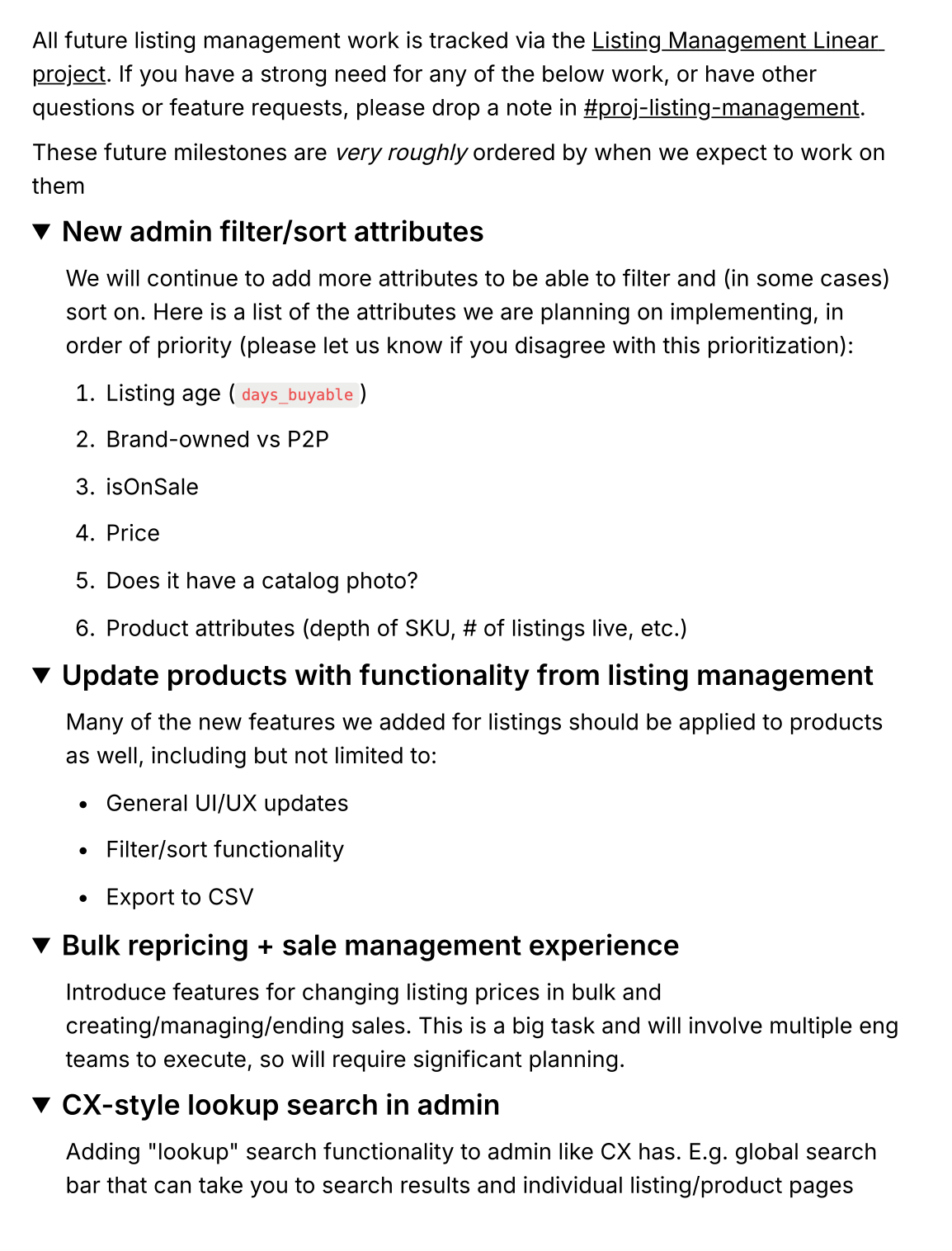
Before starting on interface design, I partnered with Product, Growth, and Engineering to map out how the platform would grow. Together, we discussed trade-offs, set priorities, and translated the new resale business into product decisions that could scale for the next phase.
Considerations & Goals
Design constraints
- Data quality varied a lot brand to brand – some brands had detailed attribute data, such as season and color, while others did not
- Requirements continued to evolve in parallel with the underlying business model
- Patterns needed to scale for future modules such as Products, Collections, and Discounts
Business Goals
- Implement merchandising tools to aid in increasing conversion and appeasing brands
- Decrease operational dependence on engineering for routine listing and merchandising
- Replace manual, spreadsheet-driven merchandising processes with scalable solutions
User needs
- Manage and merchandise resale inventory on a brand-by-brand basis
- Find and edit listings without relying on engineering or workaround tools.
- Have clear explanations for resale-specific structures or actions
Strategic Decisions
Build instead of buy
We evaluated existing merchandising platforms and found that they couldn't model resale listings without heavy customization, so we invested in a purpose-built platform.
Ship iteratively
We prioritized the workflows that consumed the most time. We released the smallest, most valuable product to improve that workflow first, then expanded it based on how people used it.
Define the functionality
Many design decisions focused on user behavior and mental models instead of just the interface. Setting shared rules early reduced ambiguity during implementation.
Mapping the System
Before designing individual screens, I mapped how Products, Listings, Collections, Reviews, and Discounts connected across the platform. This process identified reusable workflows, surfaced brand-specific requirements, and informed scalable patterns for subsequent solutions.
Examples of brand complexity:
- Manual merchandising controls for brands needing specific product presentation
- Rule-based ranking for seasonal drops and dynamic collections
- Flexible filtering approaches for brands with incomplete product metadata
Solutions
The platform evolved through four deliberate phases, with each release solving an immediate functional need and creating the foundation for the next phase.
phase 1
Collections
Collections became the merchandising foundation for the Admin platform, replacing manual workflows and establishing reusable business logic to support future features.
Before
- Merchandising relied on spreadsheets and manual organization of inventory
- Constantly changing inventory made collections difficult to maintain as listings were added, sold, or updated
- Existing 3rd party tools couldn't support the complexity of multiple listing sources, fulfillment models, and brand-specific merchandising strategies
After
- Enabled dynamic collections powered by configurable rules
- Introduced reusable sorting and prioritization logic
- Supported inventory across multiple listing sources and fulfillment models
- Allowed teams to preview matching inventory before publishing
- Reduced manual merchandising through automation
User Testing Collections
Before launching rule-based collections, we conducted moderated testing sessions with brand users, guiding them through the collection-building flow and identifying gaps between the tool’s functionality and user expectations.
Observation
Design Change
Users assumed all products shown were in stock and didn’t understand the difference from traditional e-commerce
Made “In Stock” the default view and added contextual guidance when switching views
Users expected to have to manually drag each item into order
Surfaced rule-based sorting more clearly within the interface
The trashcan icon for removing an item from a collection was interpreted as permanent deletion from the entire catalog
Replaced the icon with explicit show/hide buttons
phase 2
Listings
The original Admin experience was built around Products, but resale operates around Listings. Each listing represents a unique item with its own seller, condition, size, pricing, and fulfillment details. Without visibility into listings, Brand Success teams lacked the tools to manage the inventory actually available to customers.
Listings table
A centralized workspace for searching, filtering, and managing live inventory.
- Introduced listing-level visibility alongside product information
- Supported advanced filtering across inventory attributes and operational status
- Surfaced fulfillment and seller information needed for day-to-day operations
Listing details
A unified view for understanding and taking action on an individual listing.
- Consolidated operational actions and listing metadata into a single workflow
- Prioritized the information support teams referenced most frequently
- Established interaction patterns later reused throughout Admin
phase 3
Listing Review
Recognizing the success of the new Listing Details pattern, I identified an opportunity to reuse it within Listing Review. Leveraging this existing design pattern improved review efficiency, reduced implementation effort, and reinforced consistency.
Before
- Reviewing submitted listings required navigating between multiple disconnected screens
- Listing information and review actions were split across separate views, slowing moderation
- Existing workflows duplicated patterns that had already been solved in Listing Details
After
- Extended the successful Listing Details pattern into Listing Review
- Consolidated review tasks into a single workflow
- Designed a flexible queue for navigating between listings
- Prioritized listing information over product information
- Reused existing interaction patterns and agentic workflows to accelerate implementation
phase 4
Discounts & Seller Incentives
As partners expanded their resale programs, they needed more flexible ways to promote inventory and encourage participation. Rather than introducing disconnected tools, I extended existing platform patterns to support both merchandising and seller growth.
Discounts
Flexible promotional tools for inventory management.
- Designed configurable discount rules for targeted inventory
- Supported multiple promotional strategies without manual updates
- Reused existing collection and rules patterns for consistency
Seller incentives
Operational tools for encouraging seller participation.
- Enabled configurable incentive campaigns
- Supported partner-specific program requirements
- Reused the same interface to reduce learning and implementation effort
ongoing
Visual System & Rebrand
Transformed a collection of independently evolving tools into a cohesive internal platform. This not only created a more polished experience but also improved consistency, accelerated future development, and established a foundation for the product’s continued growth.
Before
- Admin reflected an earlier stage of the product and brand, with a dense orange-accented interface, oversized typography, and bright CTAs
- There was no shared design system across Admin, Customer Service, and Warehouse Management
- As each product evolved independently, inconsistencies accumulated, making the platform harder to maintain and scale
After
- Established a cohesive visual system that unified internal tools under Archive's new brand
- Created a shared design system with reusable components and interaction patterns
- Built a scalable foundation that improved consistency and accelerated future and agentic development
Key Design Decisions
Unified the visual system
Introduced a quieter color palette, modern typography, consistent iconography, and reusable components across Admin, Customer Service, and Warehouse Management.
Prioritized readability
Based on user interviews, I deviated from the common admin-tool convention of small text and dense layouts. We maintained larger text to reduce fatigue for teams spending hours in these workflows.
Created a scalable foundation
Established shared components, patterns, and documentation that reduced duplicated design and engineering effort. Later, partnered with Engineering to optimize agentic workflows, making them easier to extend and maintain.
Impact
Metrics have been generalized to protect confidential business performance data.
Operational Self-Service
Internal and external users could search, view, and safely edit listings without an engineering workaround for the first time
Third-Party Dependence
Building in-house avoided a costly, poorly-fitted vendor tool and let sort logic reflect resale-specific signals instead
Merchandising Efficiency
A manual, spreadsheet-driven process repeated every few weeks per brand became a rule-based system that keeps itself current
Reusable Design Patterns
Table, bulk-action, and detail-page patterns established here became the default starting point for later Admin features and other internal tools
jump to