Archive resale
Sell Options
Redesigning lululemon Like New's resale supply experience to build trust, set expectations, and help guests choose the right selling option.
View the live design
Project Overview
the problem
lululemon wanted to expand beyond in-store trade-in by introducing a mail-in option to their Like New resale program. Early testing of Archive's existing mail-in flow revealed a trust gap: guests were comfortable handing items to an associate, but hesitant to mail them away without clear visibility into value, timing, and status.
Adding mail-in also created a new decision problem. Guests now had three ways to sell their gear, but little guidance on which option best fit their goals.
the solution
I redesigned key moments across the resale journey to help guests compare sell options, understand expected earnings and timelines, and feel confident mailing in their gear. The resulting patterns were adopted as improvements to Archive's reusable resale framework.
MY ROLE
I worked with product, engineering, and brand success to identify oportunities that were : the entry point where guests choose how to sell, the trade-in and sell landing pages, and the mail-in flow and emails.
About lululemon like new
Like New is lululemon's resale marketplace, where guests can buy pre-owned gear or sell or trade-in eligible items for store credit. It is built and managed by Archive, a resale-as-a-service company for enterprise brands.
Considerations & Goals
Business goals
- Introduce mail-in trade-in as a scalable inventory source
- Encourage P2P selling first, followed by mail-in trade-in
User needs
- Understand potential earnings before investing effort
- Know what happens after an item is mailed
- Compare sell options with confidence
design constraints
- Reflect lululemon's premium brand experience
- Create patterns flexible enough to become Archive defaults
Mail-In Research
the test
We conducted moderated usability sessions with 23 lululemon guests using a real item they were considering trading in. Participants completed the full mail-in flow while thinking aloud, allowing us to identify gaps in trust, motivation, and comprehension.
The findings
Users understood the process, but not the value
The flow itself was easy to navigate, but clarity alone wasn't enough to motivate participation.
The effort-to-reward ratio felt unfavorable
Guests viewed the shipping fee and mailing effort as outweighing the financial benefit of mail-in.
Lack of visibility reduced trust
Guests wanted transparent timelines, status updates, and confirmation that their items had been received and processed.
Soltutions
Rather than redesigning the entire experience, I focused on high-leverage moments where clearer expectations and stronger decision support could improve trust and conversion.
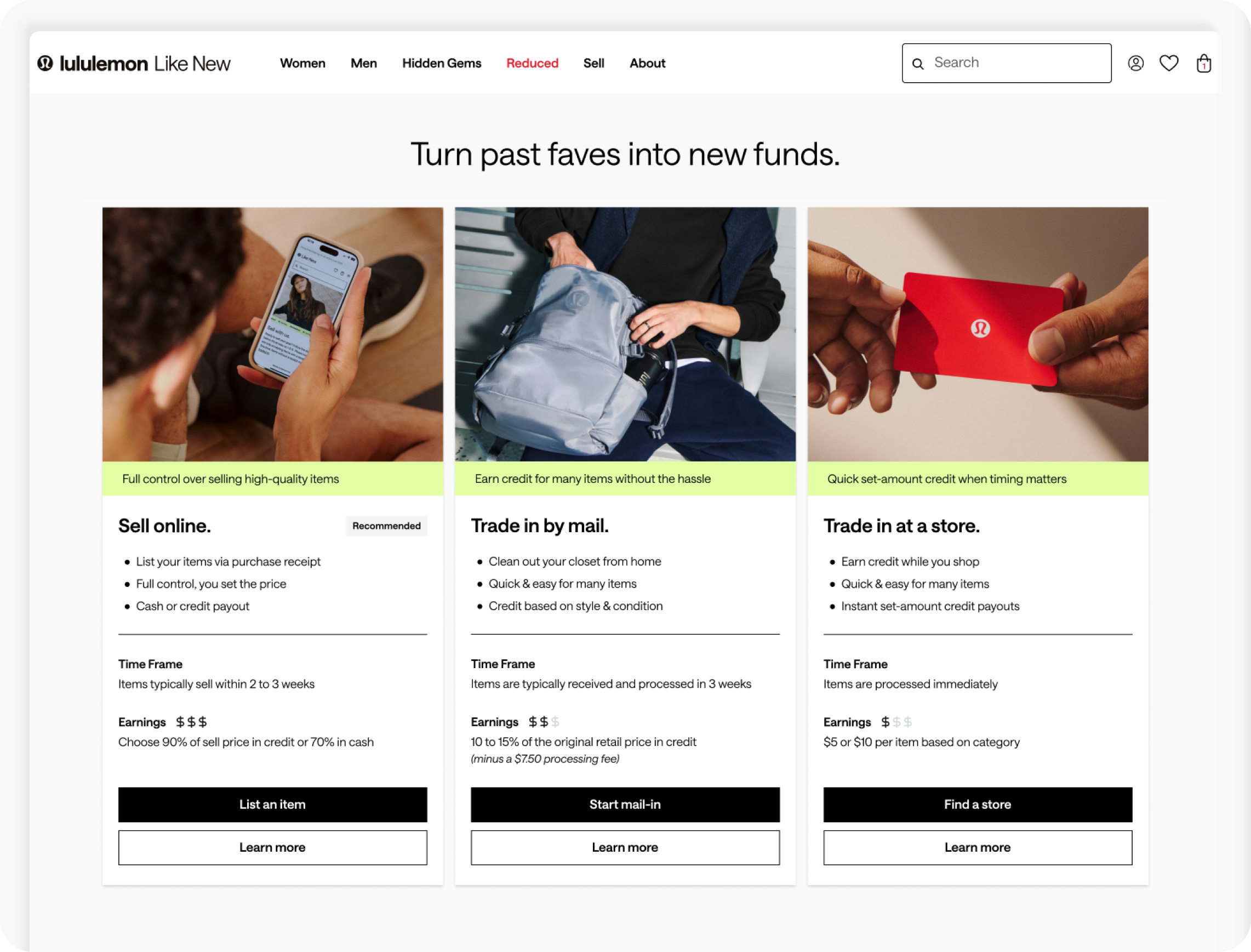
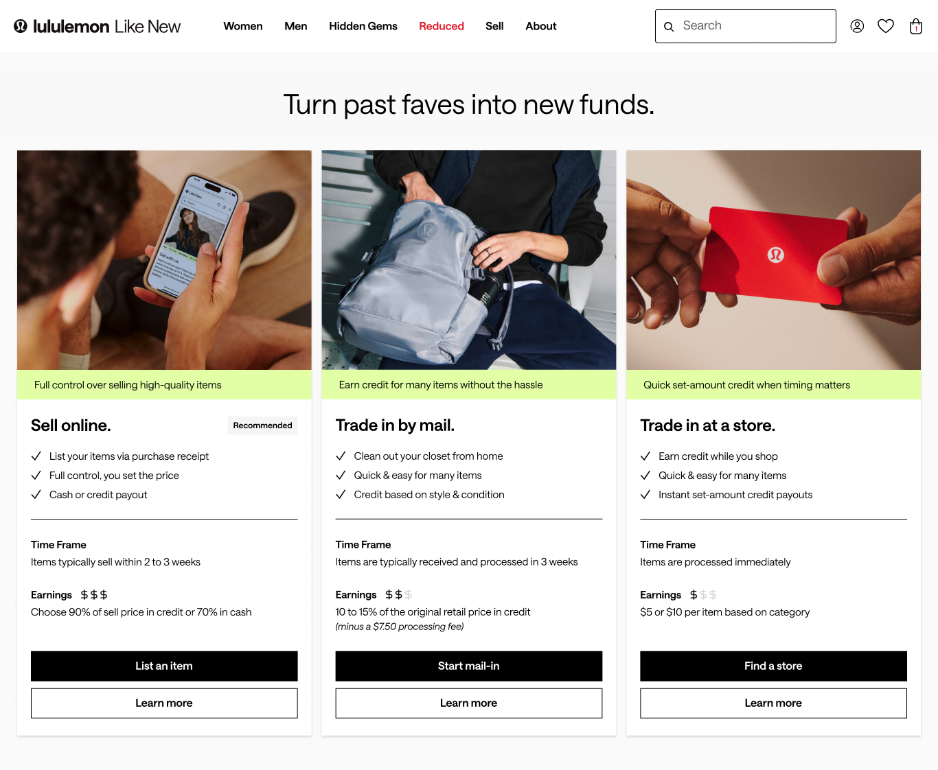
Options Overview
The introduction of a third selling option created choice overload. Guests needed a quick way to compare effort, payout, and timing before choosing a path.
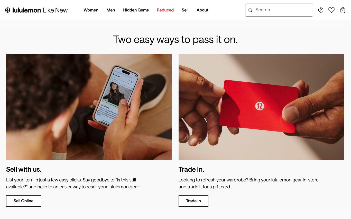
Before
The original entry point offered two options with no way to compare them.
Guests had to click into each one separately just to understand what they'd earn or how long it would take.
After
Surfaced earnings, timing, and value propositions up front to make the option hierarchy easier to understand.
Visually prioritized preferred business outcomes and the recommended option through hierarchy cues.
Offered options to start each flow or learn more, while making the recommended path easier to spot.
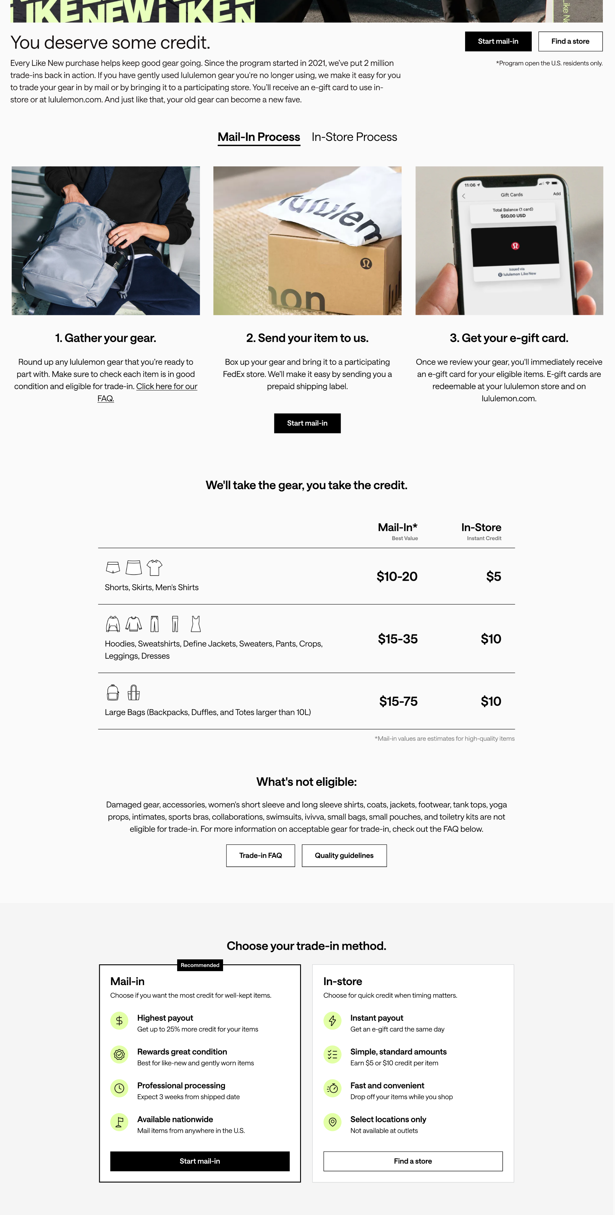
Trade-In Landing
If a user chose to learn more about trade-in, we wanted to explain the difference between mail-in and in-store trade-in, and clearly describe the processes and potential earnings.
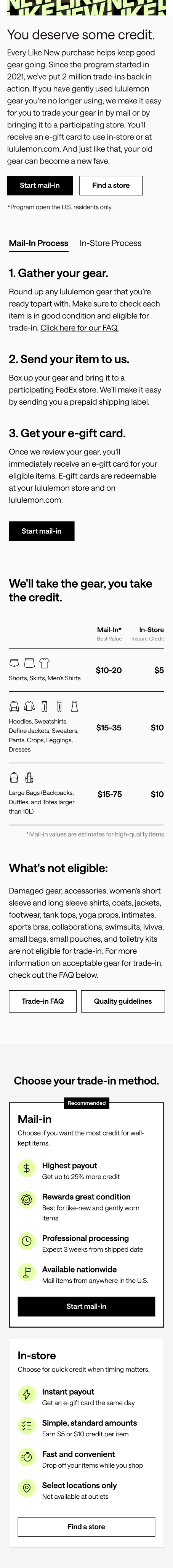
Process tabs
Guests wanted greater visibility into what happens after submitting a trade-in, so I introduced process tabs to break the journey into clear, digestible steps.
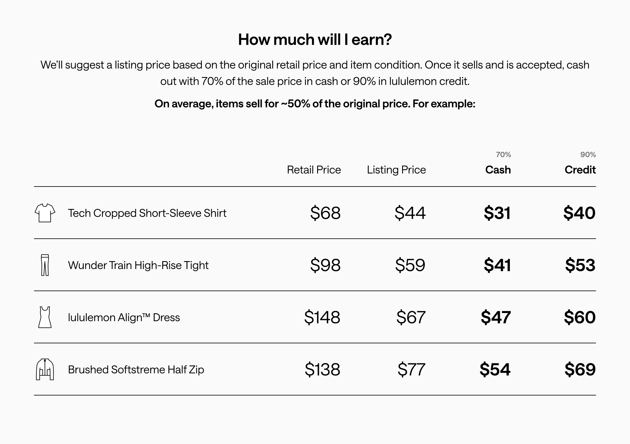
Payout comparison table
Research revealed uncertainty around the value of participating. A payout comparison helps guests understand the potential return and evaluate which trade-in method to use.
Ineligible items
Guests were often unsure whether their items qualified for trade-in. Surfacing eligibility requirements earlier helps prevent frustration.
Value messaging
For users who still felt unsure after scrolling, I added comparison cards and a nudge toward the recommended mail-in option.
Sell Landing
Research revealed that uncertainty around potential earnings made it difficult for guests to determine whether selling was worth the effort.
If a user chose to learn more about how P2P selling works, there was no information on how much they might earn.
I introduced estimated earnings ranges based on comparable items and highlighted additional earnings available through lululemon credit, helping guests compare value and understand the key proposition that sets Like New apart from other resale platforms.
Mail-In Flow
Within the intake flow, our goal shifted from decision-making to reassurance. We focused on reducing uncertainty, improving scanability, and setting clear expectations around fees and timelines.
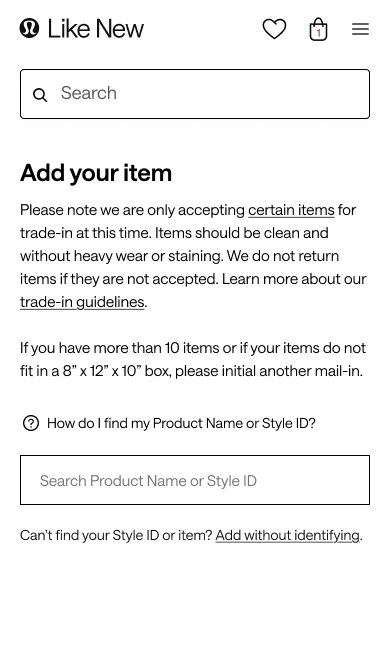
Before
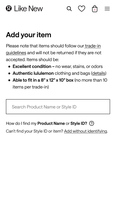
- The original "Add your item" screen led with a dense paragraph of rules - difficult to actually absorb and easy for users to skip over
- The navigation also had a search bar, making the action hierarchy muddled
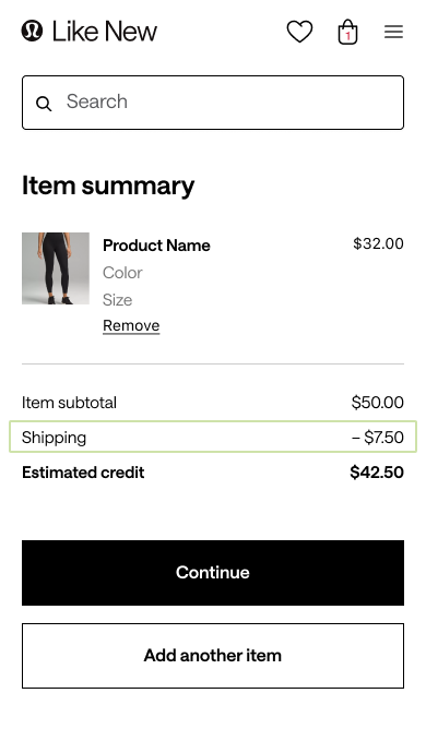
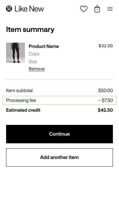
- Throughout the flow, the “Shipping” fee was very visible, and users mentioned that as a demotivating
- Users were unsure about how long it would take to receive their credit, since there was no mentions in the flow or follow-up emails
After
- Replaced dense instructions with scannable eligibility requirements
- Collapsed the navigation search bar during the trade-in flow
- Reframed the shipping charge as a processing fee to better align with user expectations and present it as a more understandable part of the experience
- Added shipping and processing timelines throughout the experience
- An additional email was added to notify the user that their trade-in had arrived at the warehouse and how long it would take to process
Impact
Metrics have been generalized to protect confidential business performance data.

Increased Adoption of Preferred Channels
More customers selected P2P selling and mail-in trade-in options over in-store
Increased Flow Initiation
More customers moved from learning about the program to starting a flow
Improved Flow Completion
More users successfully completed the sell and trade-in flows after initiating

Reduced Support Burden
Clearer guidance decreased customer questions about timing and process

Archive resale
Sell Options
Redesigning lululemon Like New's resale supply experience to build trust, set expectations, and help guests choose the right selling option.
View the live design
Project Overview
the problem
lululemon wanted to expand beyond in-store trade-in by introducing a mail-in option to their Like New resale program. Early testing of Archive's existing mail-in flow revealed a trust gap: guests were comfortable handing items to an associate, but hesitant to mail them away without clear visibility into value, timing, and status.
Adding mail-in also created a new decision problem. Guests now had three ways to sell their gear, but little guidance on which option best fit their goals.
the solution
I redesigned key moments across the resale journey to help guests compare sell options, understand expected earnings and timelines, and feel confident mailing in their gear. The resulting patterns were adopted as improvements to Archive's reusable resale framework.
MY ROLE
I worked with product, engineering, and brand success to identify oportunities that were : the entry point where guests choose how to sell, the trade-in and sell landing pages, and the mail-in flow and emails.
About lululemon like new
Like New is lululemon's resale marketplace, where guests can buy pre-owned gear or sell or trade-in eligible items for store credit. It is built and managed by Archive, a resale-as-a-service company for enterprise brands.

Considerations & Goals
Business goals
- Introduce mail-in trade-in as a scalable inventory source
- Encourage P2P selling first, followed by mail-in trade-in
User needs
- Understand potential earnings before investing effort
- Know what happens after an item is mailed
- Compare sell options with confidence
design constraints
- Reflect lululemon's premium brand experience
- Create patterns flexible enough to become Archive defaults
Mail-In Research
the test
We conducted moderated usability sessions with 23 lululemon guests using a real item they were considering trading in. Participants completed the full mail-in flow while thinking aloud, allowing us to identify gaps in trust, motivation, and comprehension.
The findings
Users understood the process, but not the value
The flow itself was easy to navigate, but clarity alone wasn't enough to motivate participation.
Lack of visibility reduced trust
Guests wanted transparent timelines, status updates, and confirmation that their items had been received and processed.
The effort-to-reward ratio felt unfavorable
Guests viewed the shipping fee and mailing effort as outweighing the financial benefit of mail-in.
Soltutions
Rather than redesigning the entire experience, I focused on high-leverage moments where clearer expectations and stronger decision support could improve trust and conversion.
Options Overview
The introduction of a third selling option created choice overload. Guests needed a quick way to compare effort, payout, and timing before choosing a path.
Before
- The original entry point offered two options with no way to compare them.
- Guests had to click into each one separately just to understand what they'd earn or how long it would take.
After
Surfaced earnings, timing, and value propositions up front to make the option hierarchy easier to understand.
Visually prioritized preferred business outcomes and the recommended option through hierarchy cues.
Offered options to start each flow or learn more, while making the recommended path easier to spot.
Trade-In Landing
If a user chose to learn more about trade-in, we wanted to explain the difference between mail-in and in-store trade-in, and clearly describe the processes and potential earnings.
Process tabs
Guests wanted greater visibility into what happens after submitting a trade-in, so I introduced process tabs to break the journey into clear, digestible steps.
Payout comparison table
Research revealed uncertainty around the value of participating. A payout comparison helps guests understand the potential return and evaluate which trade-in method to use.
Ineligible items
Guests were often unsure whether their items qualified for trade-in. Surfacing eligibility requirements earlier helps prevent frustration.
Value messaging
For users who still felt unsure after scrolling, I added comparison cards and a nudge toward the recommended mail-in option.
Sell Landing
Research revealed that uncertainty around potential earnings made it difficult for guests to determine whether selling was worth the effort.
If a user chose to learn more about how P2P selling works, there was no information on how much they might earn.
I introduced estimated earnings ranges based on comparable items and highlighted additional earnings available through lululemon credit, helping guests compare value and understand the key proposition that sets Like New apart from other resale platforms.
Mail-In Flow
Within the intake flow, our goal shifted from decision-making to reassurance. We focused on reducing uncertainty, improving scanability, and setting clear expectations around fees and timelines.
Before
- The original "Add your item" screen led with a dense paragraph of rules - difficult to actually absorb and easy for users to skip over
- The navigation also had a search bar, making the action hierarchy muddled
- Throughout the flow, the “Shipping” fee was very visible, and users mentioned that as a demotivating
- Users were unsure about how long it would take to receive their credit, since there was no mentions in the flow or follow-up emails
After
- Replaced dense instructions with scannable eligibility requirements
- Collapsed the navigation search bar during the trade-in flow
- Reframed the shipping charge as a processing fee to better align with user expectations and present it as a more understandable part of the experience
- Added shipping and processing timelines throughout the experience
- An additional email was added to notify the user that their trade-in had arrived at the warehouse and how long it would take to process
Impact
Metrics have been generalized to protect confidential business performance data.
Increased Adoption of Preferred Channels
More customers selected P2P selling and mail-in trade-in options over in-store
Increased Flow Initiation
More customers moved from learning about the program to starting a flow
Improved Flow Completion
More users successfully completed the sell and trade-in flows after initiating
Reduced Support Burden
Clearer guidance decreased customer questions about timing and process
Archive resale
Sell Options
Redesigning lululemon Like New's resale supply experience to build trust, set expectations, and help guests choose the right selling option.
View the live design

Project Overview
the problem
lululemon wanted to expand beyond in-store trade-in by introducing a mail-in option to their Like New resale program. Early testing of Archive's existing mail-in flow revealed a trust gap: guests were comfortable handing items to an associate, but hesitant to mail them away without clear visibility into value, timing, and status.
Adding mail-in also created a new decision problem. Guests now had three ways to sell their gear, but little guidance on which option best fit their goals.
the solution
I redesigned key moments across the resale journey to help guests compare sell options, understand expected earnings and timelines, and feel confident mailing in their gear. The resulting patterns were adopted as improvements to Archive's reusable resale framework.
MY ROLE
I worked with product, engineering, and brand success to identify high-impact, low-effort opportunities: the entry point where guests choose how to sell, the trade-in and sell landing pages, and the mail-in flow and emails.
About lululemon like new
Like New is lululemon's resale marketplace, where guests can buy pre-owned gear or sell or trade-in eligible items for store credit. It is built and managed by Archive, a resale-as-a-service company for enterprise brands.
Considerations & Goals
Business goals
- Introduce mail-in trade-in as a scalable inventory source
- Encourage P2P selling first, followed by mail-in trade-in
User needs
- Understand potential earnings before investing effort
- Know what happens after an item is mailed
- Compare sell options with confidence
design constraints
- Reflect lululemon's premium brand experience
- Create patterns flexible enough to become Archive defaults
Mail-In Research
the test
We conducted moderated usability sessions with 23 lululemon guests using a real item they were considering trading in. Participants completed the full mail-in flow while thinking aloud, allowing us to identify gaps in trust, motivation, and comprehension.
The findings
Users understood the process, but not the value
The flow itself was easy to navigate, but clarity alone wasn't enough to motivate participation.
The effort-to-reward ratio felt unfavorable
Guests viewed the shipping fee and mailing effort as outweighing the financial benefit of mail-in.
Lack of visibility reduced trust
Guests wanted transparent timelines, status updates, and confirmation that their items had been received and processed.
Solutions
Rather than redesigning the entire experience, I focused on high-leverage moments where clearer expectations and stronger decision support could improve trust and conversion.
Options Overview
The introduction of a third selling option created choice overload. Guests needed a quick way to compare effort, payout, and timing before choosing a path.
Before
The original entry point offered two options with no way to compare them.
Guests had to click into each one separately just to understand what they'd earn or how long it would take.
After
Surfaced earnings, timing, and value propositions up front to make the option hierarchy easier to understand.
Visually prioritized preferred business outcomes and the recommended option through hierarchy cues.
Offered options to start each flow or learn more, while making the recommended path easier to spot.
Trade-In Landing
If a user chose to learn more about trade-in, we wanted to explain the difference between mail-in and in-store trade-in, and clearly describe the processes and potential earnings.
Process tabs
Guests wanted greater visibility into what happens after submitting a trade-in, so I introduced process tabs to break the journey into clear, digestible steps.
Payout comparison table
Research revealed uncertainty around the value of participating. A payout comparison helps guests understand the potential return and evaluate which trade-in method to use.
Ineligible items
Guests were often unsure whether their items qualified for trade-in. Surfacing eligibility requirements earlier helps prevent frustration.
Value messaging
For users who still felt unsure after scrolling, I added comparison cards and a nudge toward the recommended mail-in option.
Sell Landing
Research revealed that uncertainty around potential earnings made it difficult for guests to determine whether selling was worth the effort.
If a user chose to learn more about how P2P selling works, there was no information on how much they might earn.
I introduced estimated earnings ranges based on comparable items and highlighted additional earnings available through lululemon credit, helping guests compare value and understand the key proposition that sets Like New apart from other resale platforms.
Mail-In Flow
Within the intake flow, our goal shifted from decision-making to reassurance. We focused on reducing uncertainty, improving scanability, and setting clear expectations around fees and timelines.
Before
- The original "Add your item" screen led with a dense paragraph of rules - difficult to actually absorb and easy for users to skip over
- The navigation also had a search bar, making the action hierarchy muddled
- Throughout the flow, the “Shipping” fee was very visible, and users mentioned that as a demotivating
- Users were unsure about how long it would take to receive their credit, since there was no mentions in the flow or follow-up emails
After
- Replaced dense instructions with scannable eligibility requirements
- Collapsed the navigation search bar during the trade-in flow
- Reframed the shipping charge as a processing fee to better align with user expectations and present it as a more understandable part of the experience
- Added shipping and processing timelines throughout the experience
- An additional email was added to notify the user that their trade-in had arrived at the warehouse and how long it would take to process
Impact
Metrics have been generalized to protect confidential business performance data.
Increased Adoption of Preferred Channels
More customers selected P2P selling and mail-in trade-in options over in-store
Increased Flow Initiation
More customers moved from learning about the program to starting a flow
Improved Flow Completion
More users successfully completed the sell and trade-in flows after initiating
Reduced Support Burden